Create Publication-quality Graphics
Last updated on 2023-01-03 | Edit this page
Estimated time 60 minutes
WARNING
Warning in
download.file("http://www.naturalearthdata.com/http//www.naturalearthdata.com/download/110m/physical/ne_110m_graticules_all.zip", :
cannot open URL
'https://www.naturalearthdata.com/http/www.naturalearthdata.com/download/110m/physical/ne_110m_graticules_all.zip':
HTTP status was '404 Not Found'
ERROR
Error in download.file("http://www.naturalearthdata.com/http//www.naturalearthdata.com/download/110m/physical/ne_110m_graticules_all.zip", : cannot open URL 'http://www.naturalearthdata.com/http//www.naturalearthdata.com/download/110m/physical/ne_110m_graticules_all.zip'Overview
Questions
- How can I create a publication-quality graphic and customize plot parameters?
Objectives
- Assign custom names to bands in a RasterStack.
- Customize raster plots using the
ggplot2package.
Things You’ll Need To Complete This Episode
See the lesson homepage for detailed information about the software, data, and other prerequisites you will need to work through the examples in this episode.
This episode covers how to customize your raster plots using the
ggplot2 package in R to create publication-quality
plots.
Before and After
In the previous episode, we
learned how to plot multi-band raster data in R using the
facet_wrap() function. This created a separate panel in our
plot for each raster band. The plot we created together is shown
below:
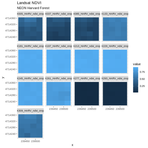
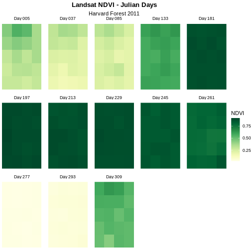
Although this plot is informative, it isn’t something we would expect to see in a journal publication. The x and y-axis labels aren’t informative. There is a lot of unnecessary gray background and the titles of each panel don’t clearly state that the number refers to the Julian day the data was collected. In this episode, we will customize this plot above to produce a publication quality graphic. We will go through these steps iteratively. When we’re done, we will have created the plot shown below.
Adjust the Plot Theme
The first thing we will do to our plot remove the x and y-axis labels
and axis ticks, as these are unnecessary and make our plot look messy.
We can do this by setting the plot theme to void.
R
ggplot() +
  geom_raster(data = NDVI_HARV_stack_df , aes(x = x, y = y, fill = value)) +
  facet_wrap(~variable) +
  ggtitle("Landsat NDVI", subtitle = "NEON Harvard Forest") +
  theme_void()

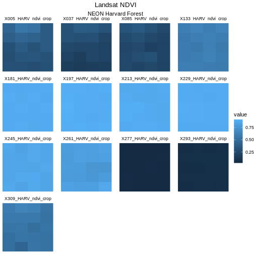
Next we will center our plot title and subtitle. We need to do this
after the theme_void() layer, because R
interprets the ggplot layers in order. If we first tell R
to center our plot title, and then set the theme to void,
any adjustments we’ve made to the plot theme will be over-written by the
theme_void() function. So first we make the theme
void and then we center the title. We center both the title
and subtitle by using the theme() function and setting the
hjust parameter to 0.5. The hjust parameter
stands for “horizontal justification” and takes any value between 0 and
1. A setting of 0 indicates left justification and a setting of 1
indicates right justification.
R
ggplot() +
  geom_raster(data = NDVI_HARV_stack_df , aes(x = x, y = y, fill = value)) +
  facet_wrap(~variable) +
  ggtitle("Landsat NDVI", subtitle = "NEON Harvard Forest") +
  theme_void() +
  theme(plot.title = element_text(hjust = 0.5),
        plot.subtitle = element_text(hjust = 0.5))
Learners can find this information in the help files for the
theme() function. The parameter to set is called
face.
R
ggplot() +
  geom_raster(data = NDVI_HARV_stack_df,
              aes(x = x, y = y, fill = value)) +
  facet_wrap(~ variable) +
  ggtitle("Landsat NDVI", subtitle = "NEON Harvard Forest") +
  theme_void() +
  theme(plot.title = element_text(hjust = 0.5, face = "bold"),
        plot.subtitle = element_text(hjust = 0.5))

Adjust the Color Ramp
Next, let’s adjust the color ramp used to render the rasters. First,
we can change the blue color ramp to a green one that is more visually
suited to our NDVI (greenness) data using the
colorRampPalette() function in combination with
colorBrewer which requires loading the
RColorBrewer library. Then we use
scale_fill_gradientn to pass the list of colours (here 20
different colours) to ggplot.
First we need to create a set of colors to use. We will select a set of nine colors from the “YlGn” (yellow-green) color palette. This returns a set of hex color codes:
R
library(RColorBrewer)
brewer.pal(9, "YlGn")
OUTPUT
[1] "#FFFFE5" "#F7FCB9" "#D9F0A3" "#ADDD8E" "#78C679" "#41AB5D" "#238443"
[8] "#006837" "#004529"
Then we will pass those color codes to the
colorRampPalette function, which will interpolate from
those colors a more nuanced color range.
R
green_colors <- brewer.pal(9, "YlGn") %>%
  colorRampPalette()
We can tell the colorRampPalette() function how many
discrete colors within this color range to create. In our case, we will
use 20 colors when we plot our graphic.
R
ggplot() +
  geom_raster(data = NDVI_HARV_stack_df , aes(x = x, y = y, fill = value)) +
  facet_wrap(~variable) +
  ggtitle("Landsat NDVI", subtitle = "NEON Harvard Forest") +
  theme_void() +
  theme(plot.title = element_text(hjust = 0.5, face = "bold"),
    plot.subtitle = element_text(hjust = 0.5)) +
  scale_fill_gradientn(name = "NDVI", colours = green_colors(20))
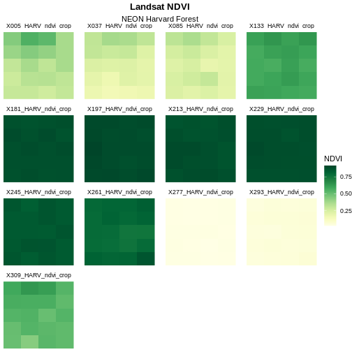
The yellow to green color ramp visually represents NDVI well given it’s a measure of greenness. Someone looking at the plot can quickly understand that pixels that are more green have a higher NDVI value.
Data Tip
For all of the brewer.pal ramp names see the brewerpal
page.
Data Tip
Cynthia Brewer, the creator of ColorBrewer, offers an online tool to help choose suitable color ramps, or to create your own. ColorBrewer 2.0; Color Advise for Cartography
Refine Plot & Tile Labels
Next, let’s label each panel in our plot with the Julian day that the
raster data for that panel was collected. The current names come from
the band “layer names”” stored in the RasterStack and the
first part of each name is the Julian day.
To create a more meaningful label we can remove the “x” and replace
it with “day” using the gsub() function in R. The syntax is
as follows:
gsub("StringToReplace", "TextToReplaceIt", object).
First let’s remove “_HARV_NDVI_crop” from each label to make the
labels shorter and remove repetition. To illustrate how this works, we
will first look at the names for our NDVI_HARV_stack
object:
R
names(NDVI_HARV_stack)
OUTPUT
 [1] "X005_HARV_ndvi_crop" "X037_HARV_ndvi_crop" "X085_HARV_ndvi_crop"
 [4] "X133_HARV_ndvi_crop" "X181_HARV_ndvi_crop" "X197_HARV_ndvi_crop"
 [7] "X213_HARV_ndvi_crop" "X229_HARV_ndvi_crop" "X245_HARV_ndvi_crop"
[10] "X261_HARV_ndvi_crop" "X277_HARV_ndvi_crop" "X293_HARV_ndvi_crop"
[13] "X309_HARV_ndvi_crop"
Now we will use the gsub() function to find the
character string “_HARV_ndvi_crop” and replace it with a blank string
(““). We will assign this output to a new object
(raster_names) and look at that object to make sure our
code is doing what we want it to.
R
raster_names <- names(NDVI_HARV_stack)

raster_names <- gsub("_HARV_ndvi_crop", "", raster_names)
raster_names
OUTPUT
 [1] "X005" "X037" "X085" "X133" "X181" "X197" "X213" "X229" "X245" "X261"
[11] "X277" "X293" "X309"
So far so good. Now we will use gsub() again to replace
the “X” with the word “Day” followed by a space.
R
raster_names  <- gsub("X", "Day ", raster_names)
raster_names
OUTPUT
 [1] "Day 005" "Day 037" "Day 085" "Day 133" "Day 181" "Day 197" "Day 213"
 [8] "Day 229" "Day 245" "Day 261" "Day 277" "Day 293" "Day 309"
Our labels look good now. Let’s reassign them to our
all_NDVI_HARV object:
R
labels_names <- setNames(raster_names, unique(NDVI_HARV_stack_df$variable))
Once the names for each band have been reassigned, we can render our
plot with the new labels using alabeller.
R
ggplot() +
  geom_raster(data = NDVI_HARV_stack_df , aes(x = x, y = y, fill = value)) +
  facet_wrap(~variable, labeller = labeller(variable = labels_names)) +
  ggtitle("Landsat NDVI", subtitle = "NEON Harvard Forest") +
  theme_void() +
  theme(plot.title = element_text(hjust = 0.5, face = "bold"),
    plot.subtitle = element_text(hjust = 0.5)) +
  scale_fill_gradientn(name = "NDVI", colours = green_colors(20))

Change Layout of Panels
We can adjust the columns of our plot by setting the number of
columns ncol and the number of rows nrow in
facet_wrap. Let’s make our plot so that it has a width of
five panels.
R
ggplot() +
  geom_raster(data = NDVI_HARV_stack_df , aes(x = x, y = y, fill = value)) +
  facet_wrap(~variable, ncol = 5, labeller = labeller(variable = labels_names)) +
  ggtitle("Landsat NDVI", subtitle = "NEON Harvard Forest") +
  theme_void() +
  theme(plot.title = element_text(hjust = 0.5, face = "bold"),
    plot.subtitle = element_text(hjust = 0.5)) +
  scale_fill_gradientn(name = "NDVI", colours = green_colors(20))
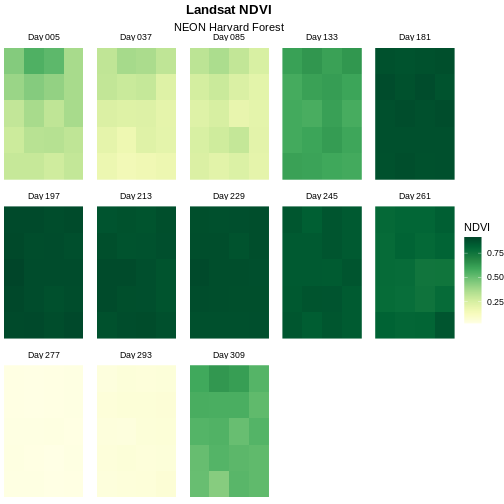
Now we have a beautiful, publication quality plot!
Challenge: Divergent Color Ramps
When we used the gsub() function to modify the tile
labels we replaced the beginning of each tile title with “Day”. A more
descriptive name could be “Julian Day”. Update the plot above with the
following changes:
- Label each tile “Julian Day” with the julian day value following.
- Change the color ramp to a divergent brown to green color ramp.
Questions: Does having a divergent color ramp represent the data better than a sequential color ramp (like “YlGn”)? Can you think of other data sets where a divergent color ramp may be best?
R
raster_names  <- gsub("Day","Julian Day ", raster_names)
labels_names <- setNames(raster_names, unique(NDVI_HARV_stack_df$variable))

brown_green_colors <- colorRampPalette(brewer.pal(9, "BrBG"))

ggplot() +
  geom_raster(data = NDVI_HARV_stack_df , aes(x = x, y = y, fill = value)) +
  facet_wrap(~variable, ncol = 5, labeller = labeller(variable = labels_names)) +
  ggtitle("Landsat NDVI - Julian Days", subtitle = "Harvard Forest 2011") +
  theme_void() +
  theme(plot.title = element_text(hjust = 0.5, face = "bold"),
  plot.subtitle = element_text(hjust = 0.5)) +
  scale_fill_gradientn(name = "NDVI", colours = brown_green_colors(20))
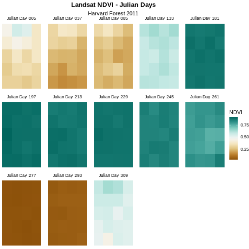
For NDVI data, the sequential color ramp is better than the divergent as it is more akin to the process of greening up, which starts off at one end and just keeps increasing.
